The complete guide to configuring your Tailwind website with Nintu templates and bricks builder.

This guide is pending an update, in the meantime please read this article to setup and configure your winden settings and start using nintu templates.
Step 1: Install bricks builder and winden.
To get started, head over to your plugins tab from you WordPress dashboard, click on add new and upload winden.
Once winden is installed and activated, now head over to the appearance tab from you WordPress dashboard, themes, add new and upload the bricks builder theme.
With the bricks theme installed and activated, go into settings and enable both “code execution” for admins and “svg uploads”.
Step 2: Setting up style essentials for bricks.
Next up we want to add some essential CSS to bricks for a better overall experience. Here’s what we’re going to be adding:
- Bricks body styles: We’re going to be adding a few lines of CSS to improve the overall experience when building responsive content on bricks, we’re essentially going to tell the browser to never display content that is falling outside of the screen width, this will prevent that buggy horizontal scrolling on mobile when elements are slightly bigger than the viewport.
- Scrollbar styling: More of a nice to have, but let’s customize our website scrollbar to match our brand instead of having the default grey one. There are 5 parts to this: width, handle, track, handle on hover and track on hover.
- HTML font size: By default bricks sets the html font size to 64.5% which messes with the rest of our sizing. We want to simply set it to 100% so that everything we size actually gets output at the same size we specify.
- (Optional) Fix SureCart x bricks conflict: If you’re planning on using SureCart or any of the SureCrafted products they have a small styling conflict which we will resolve with a couple of lines of CSS.
Below is all the CSS you need for your essential styles. Head over to the winden tab from your dashboard and paste in the code below into the “Global CSS *” field. You can clear anything that was there by default.
@tailwind base;
@tailwind components;
@tailwind utilities;
/* Bricks body styles */
#brx-content {
	max-width:100vw;
	position:relative;
	overflow:hidden;
}

/* Style your scrollbar with the settings below */
::-webkit-scrollbar {
  width: 10px;
}
/* Track */
::-webkit-scrollbar-track {
  background: #71717a;
}
/* Handle */
::-webkit-scrollbar-thumb {
  background: #18181b;
}
/* Handle on hover */
::-webkit-scrollbar-thumb:hover {
  background: #f12139;
}
/* Track */
::-webkit-scrollbar-track:hover {
  background: #730714;
}

/* Set Bricks Font Size to match Tailwind font size */
html {
  font-size: 100%;
}

/* Fix for surecart checkout that gets overridden by bricks */
sc-price-choices[type="radio"],
sc-price-choice[type="radio"] {
  width: auto;
  height: auto;
  display: block;
}
Step 3: Setting up fluid typography and spacing.
Fluid essentially scales your typography and space sizes depending on the screen size. This is a simple way to give your users a great experience and cut down on development time. It eliminates the need to specify how big or small different text and space should be on different browser screens. We’re going to tell winden/tailwind that we want to use fluid settings for all typography and spacing by defining it under the same “Global CSS *”field.
Just below what you just pasted in step 2, add the following:
/* Fluid font size variables, for browsers that support clamp */
@supports (font-size: clamp(1rem, 1vw, 1rem)) {
  :root {
    --font-size-xs: clamp(0.79rem, -0.24vw + 0.85rem, 0.57rem);
    --font-size-sm: clamp(0.89rem, -0.14vw + 0.92rem, 0.75rem);
    --font-size-base: clamp(1rem, 0vw + 1rem, 1rem);
    --font-size-lg: clamp(1.13rem, 0.22vw + 1.07rem, 1.33rem);
    --font-size-xl: clamp(1.27rem, 0.53vw + 1.13rem, 1.77rem);
    --font-size-2xl: clamp(1.42rem, 0.98vw + 1.18rem, 2.35rem);
    --font-size-3xl: clamp(1.6rem, 1.61vw + 1.2rem, 3.13rem);
    --font-size-4xl: clamp(1.8rem, 2.48vw + 1.18rem, 4.16rem);
    --font-size-5xl: clamp(2.03rem, 3.69vw + 1.1rem, 5.53rem);
    --font-size-6xl: clamp(2.28rem, 5.35vw + 0.94rem, 7.36rem);
    --font-size-7xl: clamp(2.57rem, 7.61vw + 0.66rem, 9.79rem);
  }
}

/* Fluid spacing size variables, for browsers that support clamp */
@supports (font-size: clamp(1rem, 1vw, 1rem)) {
  :root {
    --spacing-05: clamp(0.44rem, -0.45vw + 0.55rem, 0.01rem);
    --spacing-1: clamp(0.49rem, -0.51vw + 0.62rem, 0.01rem);
    --spacing-15: clamp(0.55rem, -0.57vw + 0.7rem, 0.02rem);
    --spacing-2: clamp(0.62rem, -0.64vw + 0.78rem, 0.02rem);
    --spacing-25: clamp(0.7rem, -0.71vw + 0.88rem, 0.03rem);
    --spacing-3: clamp(0.79rem, -0.79vw + 0.99rem, 0.04rem);
    --spacing-35: clamp(0.89rem, -0.89vw + 1.11rem, 0.05rem);
    --spacing-4: clamp(1rem, -0.99vw + 1.25rem, 0.06rem);
    --spacing-5: clamp(1.13rem, -1.1vw + 1.4rem, 0.08rem);
    --spacing-6: clamp(1.27rem, -1.22vw + 1.57rem, 0.11rem);
    --spacing-7: clamp(1.42rem, -1.34vw + 1.76rem, 0.15rem);
    --spacing-8: clamp(1.6rem, -1.48vw + 1.97rem, 0.2rem);
    --spacing-9: clamp(1.8rem, -1.62vw + 2.21rem, 0.26rem);
    --spacing-10: clamp(2.03rem, -1.77vw + 2.47rem, 0.35rem);
    --spacing-11: clamp(2.28rem, -1.92vw + 2.76rem, 0.46rem);
    --spacing-12: clamp(2.57rem, -2.06vw + 3.08rem, 0.61rem);
    --spacing-14: clamp(2.89rem, -2.18vw + 3.43rem, 0.81rem);
    --spacing-16: clamp(3.25rem, -2.28vw + 3.82rem, 1.08rem);
    --spacing-20: clamp(3.65rem, -2.33vw + 4.24rem, 1.44rem);
    --spacing-24: clamp(4.11rem, -2.31vw + 4.69rem, 1.91rem);
    --spacing-28: clamp(4.62rem, -2.19vw + 5.17rem, 2.55rem);
    --spacing-32: clamp(5.2rem, -1.91vw + 5.68rem, 3.39rem);
    --spacing-36: clamp(5.85rem, -1.42vw + 6.21rem, 4.5rem);
    --spacing-40: clamp(6.58rem, -0.62vw + 6.74rem, 5.99rem);
    --spacing-44: clamp(7.41rem, 0.59vw + 7.26rem, 7.97rem);
    --spacing-48: clamp(8.33rem, 2.38vw + 7.74rem, 10.6rem);
    --spacing-52: clamp(9.37rem, 4.97vw + 8.13rem, 14.09rem);
    --spacing-56: clamp(10.55rem, 8.63vw + 8.39rem, 18.75rem);
    --spacing-60: clamp(11.86rem, 13.76vw + 8.42rem, 24.93rem);
    --spacing-64: clamp(13.35rem, 20.86vw + 8.13rem, 33.16rem);
    --spacing-72: clamp(15.01rem, 30.62vw + 7.36rem, 44.1rem);
    --spacing-80: clamp(16.89rem, 43.96vw + 5.9rem, 58.66rem);
    --spacing-96: clamp(19rem, 62.12vw + 3.47rem, 78.01rem);
  }
}
Validating our “Global CSS *” field:
By now we have defined all the CSS we need for winden to work with bricks and for all our typography and spacing to be fluid. Your the total content of this field should now look like this:
@tailwind base;
@tailwind components;
@tailwind utilities;
/* Bricks body styles */
#brx-content {
  max-width: 100vw;
  position: relative;
  overflow: hidden;
}

/* Style your scrollbar with the settings below */
::-webkit-scrollbar {
  width: 10px;
}
/* Track */
::-webkit-scrollbar-track {
  background: #71717a;
}
/* Handle */
::-webkit-scrollbar-thumb {
  background: #18181b;
}
/* Handle on hover */
::-webkit-scrollbar-thumb:hover {
  background: #f12139;
}
/* Track */
::-webkit-scrollbar-track:hover {
  background: #730714;
}

/* Set Bricks Font Size to match Tailwind font size */
html {
  font-size: 100%;
}

/* Fix for surecart checkout that gets overridden by bricks */
sc-price-choices[type="radio"],
sc-price-choice[type="radio"] {
  width: auto;
  height: auto;
  display: block;
}

/* Fluid font size variables, for browsers that support clamp */
@supports (font-size: clamp(1rem, 1vw, 1rem)) {
  :root {
    --font-size-xs: clamp(0.79rem, -0.24vw + 0.85rem, 0.57rem);
    --font-size-sm: clamp(0.89rem, -0.14vw + 0.92rem, 0.75rem);
    --font-size-base: clamp(1rem, 0vw + 1rem, 1rem);
    --font-size-lg: clamp(1.13rem, 0.22vw + 1.07rem, 1.33rem);
    --font-size-xl: clamp(1.27rem, 0.53vw + 1.13rem, 1.77rem);
    --font-size-2xl: clamp(1.42rem, 0.98vw + 1.18rem, 2.35rem);
    --font-size-3xl: clamp(1.6rem, 1.61vw + 1.2rem, 3.13rem);
    --font-size-4xl: clamp(1.8rem, 2.48vw + 1.18rem, 4.16rem);
    --font-size-5xl: clamp(2.03rem, 3.69vw + 1.1rem, 5.53rem);
    --font-size-6xl: clamp(2.28rem, 5.35vw + 0.94rem, 7.36rem);
    --font-size-7xl: clamp(2.57rem, 7.61vw + 0.66rem, 9.79rem);
  }
}

/* Fluid spacing size variables, for browsers that support clamp */
@supports (font-size: clamp(1rem, 1vw, 1rem)) {
  :root {
    --spacing-05: clamp(0.44rem, -0.45vw + 0.55rem, 0.01rem);
    --spacing-1: clamp(0.49rem, -0.51vw + 0.62rem, 0.01rem);
    --spacing-15: clamp(0.55rem, -0.57vw + 0.7rem, 0.02rem);
    --spacing-2: clamp(0.62rem, -0.64vw + 0.78rem, 0.02rem);
    --spacing-25: clamp(0.7rem, -0.71vw + 0.88rem, 0.03rem);
    --spacing-3: clamp(0.79rem, -0.79vw + 0.99rem, 0.04rem);
    --spacing-35: clamp(0.89rem, -0.89vw + 1.11rem, 0.05rem);
    --spacing-4: clamp(1rem, -0.99vw + 1.25rem, 0.06rem);
    --spacing-5: clamp(1.13rem, -1.1vw + 1.4rem, 0.08rem);
    --spacing-6: clamp(1.27rem, -1.22vw + 1.57rem, 0.11rem);
    --spacing-7: clamp(1.42rem, -1.34vw + 1.76rem, 0.15rem);
    --spacing-8: clamp(1.6rem, -1.48vw + 1.97rem, 0.2rem);
    --spacing-9: clamp(1.8rem, -1.62vw + 2.21rem, 0.26rem);
    --spacing-10: clamp(2.03rem, -1.77vw + 2.47rem, 0.35rem);
    --spacing-11: clamp(2.28rem, -1.92vw + 2.76rem, 0.46rem);
    --spacing-12: clamp(2.57rem, -2.06vw + 3.08rem, 0.61rem);
    --spacing-14: clamp(2.89rem, -2.18vw + 3.43rem, 0.81rem);
    --spacing-16: clamp(3.25rem, -2.28vw + 3.82rem, 1.08rem);
    --spacing-20: clamp(3.65rem, -2.33vw + 4.24rem, 1.44rem);
    --spacing-24: clamp(4.11rem, -2.31vw + 4.69rem, 1.91rem);
    --spacing-28: clamp(4.62rem, -2.19vw + 5.17rem, 2.55rem);
    --spacing-32: clamp(5.2rem, -1.91vw + 5.68rem, 3.39rem);
    --spacing-36: clamp(5.85rem, -1.42vw + 6.21rem, 4.5rem);
    --spacing-40: clamp(6.58rem, -0.62vw + 6.74rem, 5.99rem);
    --spacing-44: clamp(7.41rem, 0.59vw + 7.26rem, 7.97rem);
    --spacing-48: clamp(8.33rem, 2.38vw + 7.74rem, 10.6rem);
    --spacing-52: clamp(9.37rem, 4.97vw + 8.13rem, 14.09rem);
    --spacing-56: clamp(10.55rem, 8.63vw + 8.39rem, 18.75rem);
    --spacing-60: clamp(11.86rem, 13.76vw + 8.42rem, 24.93rem);
    --spacing-64: clamp(13.35rem, 20.86vw + 8.13rem, 33.16rem);
    --spacing-72: clamp(15.01rem, 30.62vw + 7.36rem, 44.1rem);
    --spacing-80: clamp(16.89rem, 43.96vw + 5.9rem, 58.66rem);
    --spacing-96: clamp(19rem, 62.12vw + 3.47rem, 78.01rem);
  }
}
Step 3: Generating your brand colors for nintu bricks builder templates.
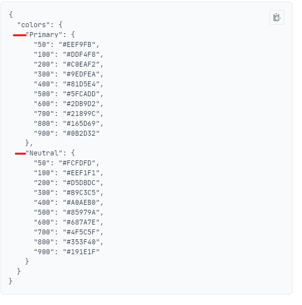
Winden/Tailwind has a great color system and design methodology for colors and their shades, in this example we will be using one core brand color and one core neutral color, which will then be split out into 10 shades each.
Your brand shades:
Don’t worry if you don’t have a complete shade palette for your brand, there are lots of tools online to help you do so and I’m going to walk you through my favorite one:
- TailwindCSS brand color generation: Head over to this site and put your primary color into the primary swatch, and a neutral (grey) color into the neutral swatch. A good trick to make sure you have a good set of shades is to make sure your primary 500 color is the main, bright, catchy color you want to attract peoples attention and the neutral 50 color is really close to white. You can adjust the hue, saturation and lightness on the color tool as can be seen in the images below.

- Understanding your colors: Now that you’ve generated your primary and neutral colors, scroll down the page a little and you will see a breakdown of what this looks like from a code perspective. When designing with tailwind we often use all 10 shades on a site especially when added light/dark mode and subtle design elements. Your output should look something like this the image below. Keep it open in a separate tab for now as we’ll come back to this in the next step.
Step 4: Bringing it all together for a complete experience with nintu, winden and bricks builder templates.
This is the final step. We’re now going to tell winden where to use everything we’ve just completed. We’ll be giving the “Tailwind Config *” the following settings:
- Dark mode: Enable dark mode to be used on our website when required.
- Brand colors: Telling tailwind what our brand colors are which automates color settings when importing nintu templates for bricks.
- Fluid type: Match tailwind typography to the fluid setting we defined in step 3.
- Fluid spacing: Match tailwind’s spacing settings to the fluid ones we defined in step 3.
Lets start by importing or copy-pasting all the content and then we will jump in and update the colors to the ones we created in the previous step. Copy and paste the following into your “Tailwind Config *” field under the winden settings tab:
module.exports = {
  darkMode: 'class',
  theme: {
    extend: {
      colors: {
        p: {
          50: '#FEF5F6',
          100: '#FDE7EA',
          200: '#FCCAD0',
          300: '#FAA9B2',
          400: '#F77D8C',
          500: '#F12139',
          600: '#DD0E26',
          700: '#C50C22',
          800: '#A30A1C',
          900: '#730714',
        },
        n: {
          50: '#fafafa',
          100: '#f4f4f5',
          200: '#e4e4e7',
          300: '#d4d4d8',
          400: '#a1a1aa',
          500: '#71717a',
          600: '#52525b',
          700: '#3f3f46',
          800: '#27272a',
          900: '#18181b',
        },
      },
    },
    fontSize: {
      xs: 'var(--font-size-xs)',
      sm: 'var(--font-size-sm)',
      base: 'var(--font-size-base)',
      lg: 'var(--font-size-lg)',
      xl: 'var(--font-size-xl)',
      '2xl': 'var(--font-size-2xl)',
      '3xl': 'var(--font-size-3xl)',
      '4xl': 'var(--font-size-4xl)',
      '5xl': 'var(--font-size-5xl)',
      '6xl': 'var(--font-size-6xl)',
      '7xl': 'var(--font-size-7xl)',
    },
    spacing: {
      '0': '0',
      px: '1px',
      '0.5': 'var(--spacing-05)',
      1: 'var(--spacing-1)',
      1.5: 'var(--spacing-05)',
      2: 'var(--spacing-2)',
      2.5: 'var(--spacing-25)',
      3: 'var(--spacing-3)',
      3.5: 'var(--spacing-35)',
      4: 'var(--spacing-4)',
      5: 'var(--spacing-5)',
      6: 'var(--spacing-6)',
      7: 'var(--spacing-7)',
      8: 'var(--spacing-8)',
      9: 'var(--spacing-9)',
      10: 'var(--spacing-10)',
      11: 'var(--spacing-11)',
      12: 'var(--spacing-12)',
      14: 'var(--spacing-14)',
      16: 'var(--spacing-16)',
      20: 'var(--spacing-20)',
      24: 'var(--spacing-24)',
      28: 'var(--spacing-28)',
      32: 'var(--spacing-32)',
      36: 'var(--spacing-36)',
      40: 'var(--spacing-40)',
      44: 'var(--spacing-44)',
      48: 'var(--spacing-48)',
      52: 'var(--spacing-52)',
      56: 'var(--spacing-56)',
      60: 'var(--spacing-60)',
      64: 'var(--spacing-64)',
      72: 'var(--spacing-72)',
      80: 'var(--spacing-80)',
      96: 'var(--spacing-96)',
    },
    maxWidth: {
      '0': '0',
      none: 'none',
      xs: '20rem',
      sm: '24rem',
      md: '28rem',
      lg: '32rem',
      xl: '36rem',
      '2xl': '42rem',
      '3xl': '48rem',
      '4xl': '56rem',
      '5xl': '64rem',
      '6xl': '72rem',
      '7xl': '80rem',
      full: '100%',
      min: 'min-content',
      max: 'max-content',
      fit: 'fit-content',
      prose: '65ch',
      'screen-sm': '640px',
      'screen-md': '768px',
      'screen-lg': '1024px',
      'screen-xl': '1280px',
      'screen-2xl': '1536px',
    },
  },
  plugins: [],
  corePlugins: {
    preflight: false,
  },
}
Update your colors.
Finally we want to update the colors from the default nintu ones to your brand colors. Jump back to your tailwind color generator and copy the colors that sit under “Primary” and replace the colors that sit under “P”, then copy the colors that sit under “Neutral” and replace the colors that sit under “N”.

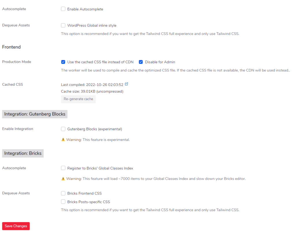
Saving changes and other settings.
That’s pretty much it. You can now import templates from nintu at the click of a button and they will automatically scale fluidly and match your brand colors. Before you leave the page make sure to save your settings as we most likely won’t be touching them again for a while. You don’t need to Deque any assets, and I would not recommend turning on Autocomplete for the bricks integration as you’re adding a lot of extra classes to bricks and it slows down the builder. Once you’re ready to publish your site toggle on production mode, save and re-generate the cache. This will enable super fast page loading for your visitors. Here’s a last little screenshot of what my settings look like: